20111027

Creating Patterns in Photoshop

I've had a few people asking me how to make patterns in Photoshop, so I googled "making patterns in photoshop" just in case if anybody asked me that again, I could just pull that page up, but to my surprise, I couldn't find a single page that explained the way I create mine (at least in the first page of the search result), so I decided to do a tutorial for it instead.

I mean, the only one that I know of that explains the way I do it is in Japanese ("Photoshopで作るパターン" by 柴漬け), so yeah :/

The way I create my patterns is a combination of the link mentioned above and this ("WELCOME JULIA AND HOW TO MAKE A REPEAT PATTERN" on Design Sponge by Grace Bonney).

I'll be adding in images later today for the steps because I don't have a simple pattern that follows these instructions at the moment.

1. Draw your design. This could be done either on paper or just straight on the computer. If you're doing it on paper, scan it in once you're done drawing (300dpi recommended when scanning in) and adjust the image on Photoshop later, using the options listed under Image > Adjustments. I usually just use "Brightness/Contrast" and "Levels." If you don't know what they do, just play around with it a little until you're satisfied with the result (when making the adjustments, if you don't have the "Preview" option checked already, do so--it'll save your life).

2. Open your image on Photoshop. Go to Filter > Other > Offset. This will allow you to wrap your image vertically/horizontally on the canvas seamlessly. Type in half the width/height of your design, so that it'll appear on all 4 corners. Now you have a giant white space in the middle.

3. Fill the empty space. If you're doing it on paper, print your image, and then proceed to drawing in the design. Once done, scan it in again; however, this time, be careful to line it up as perfectly straight as possible on the scanner, or else you'll have some extra tweaking to do in Photoshop later.*

4. Create a pattern. Go to Edit > Define Pattern. Name your pattern and hit enter. Congratulations, you've now created a pattern in Photoshop :) Don't forget to save your file too! If your design is done on paper,** it's probably huge, so resize it to whatever size you want (Image > Image Size / Command+Alt+I), and then define the pattern.

You can now use your pattern by using the Paint Bucket tool. Change its option from "Foreground" to "Pattern" and select your newly created pattern. Create a new file and test the pattern out.


* If you were like me and did something like this,
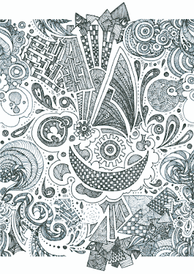
you need to do some tweaking before you define your pattern. For this image I did the following:

First off, it's not even scanned in straight, so I needed to rotate the canvas 0.3 degrees counter-clockwise and crop the excess white space out. Then, I wrapped the image vertically using Offset until I got something like this:
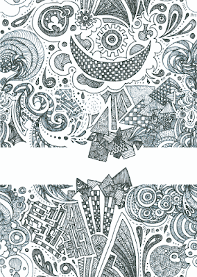

Using the Rectangular Marquee Tool, I selected the bottom part of the design and cut and pasted the selection onto a new layer. Next, I changed the layer mode to "Multiply," so that I could see what's under it and lined it up with the upper part.
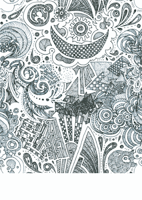

From here, I could've erased the overlapping parts, but I decided not to because I was being lazy it looked kind of neat. Then, I cropped out the excess space again.
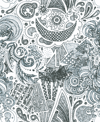

I merged the layers, and tadah--I'm done.

Well, not really for this particular design because I colored it. I made a new layer, set the mode to Multiply, and filled in with blue.
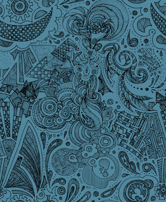

Okay, NOW I'm really done.

**Your design probably doesn't line up perfectly by like 1 or 2 pixels because it's a scanned in image, but don't fret--there's a reason why it's in 300dpi: when you scale it down, you won't be able to see the flaw. But if you're a perfectionist, you could play with Offset and clean the connecting parts.


Hooray for patterns~ they're so fun to make! I've only made 3 so far, but I'm planning to make more when I find the time to do it *u* Here's the other 2 that I've made so far:
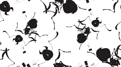

For GRD 4100 Magazine Featured Article ("Deeply unsettling wallpapers"). I made this using Illustrator and Photoshop.
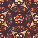

For GRD 4020 Wine Bottle Redesign / this blog bg.

20111022

Well that was a fail

I thought that this week's word for the 600Pixel Project was nocturnal, so I was drawing a picture for it, but right when I was about to make a post, I found out that it wasn't; it was oceanic. Such a fail lol.

So instead of posting it over there, I figured I could just post it on my blog. And I made it an animation hooray.


Each week

(Can you tell that I'm trying not to lag behind on my assignments now? ;D)

I feel as though I must check in at/with


...but what I actually check in at/with (aside from Facebook, Youtube, and e-mail)


Mixi: Kind of like the Japanese Facebook. Mainly used to find out how my friends/family in Japan are doing.


NicoNico Video: Kind of like the Japanese Youtube. Enough said?


Pixiv: Kind of like the Japanese DeviantART, but with only the illustration category.


Tegaki: A drawing blog community. Here's the Japanese version


Just because I visit all these drawing communities doesn't necessarily mean that I submit my work that often though; lately, I've been just lurking around, stalking other people's pages because I haven't had the time to spend nearly as much time as I would want to for my illustrations. How lame. All I've been drawing are just sketches/doodles in my sketchbook that I do in Marta on the way to GSU/home.


Speaking of drawing:


PoseManiacs: A website that I REALLY SHOULD get back to--I don't know how much more I need to emphasize this to myself. It's been way too long since I last did the 30 second drawings on this site on a daily basis..

20111021

Revised Posters


So after receiving Stan's e-mail, I was a bit disappointed with my grades, so I went ahead and changed some stuff up:


1. Color combination - unsaturated them and added a third color, yellow. Simplified the wings for some of the birds because they looked too complex than others.

2. Day --> night sky. Added another layer of cloud behind the brightest one for more depth, drew in the constellation because the space looked a little empty, and changed the gradation in the sky from purplish red to blue in order to connect the colors more with the typeface. Also, took away the excess type decoration and bolded only the type name.

3. Changed the foot to a more unsaturated green and lowered the opacity, so that the type will pop out more compared to it.


I actually had 2 more versions of these with different color combinations, but I liked this one the most.


ALSO, I changed my blog design :)

I'm going to be using this blog background pattern for my Takara Plum bottle design as well (though that should've been the other way around since I designed it for the bottle, not my blog). The header image is to be swapped with something else later if I have time. I dunno.

20111016

Printed Material

Another late blog assignment. I need to change this habit, I know.


20111007

Takara Umeshu Redesign

LOL so I totally failed at the product choices because I didn't see Stan's post until after I bought them :/ At least the Takara Umeshu hadn't been done yet.


Some ideas I had in mind for my sake bottle product redesign:


Japanese calligraphy


For the label that'll be wrapping around the bottle. I haven't done Japanese calligraphy since.. what, elementary school? slfdkajfhjdflandIwasneverreallygoodatitinthefirstplacesldkfjaflk at least I have all the supplies already.

Kinchaku (drawstring bag)


Instead of a box, I'll most likely be using this.. er, making this. Too bad I don't have a sewing machine... so I'm gonna be stabbing myself with a needle for the next few weeks. If this doesn't work out, I'll be using a wooden box that'll have some kind of laser printing on the front.

Ume patterns


Some examples of ume patterns for the kinchaku bag.


Resources:


Spoonflower

What I'll be using to get my ume patterns printed from. Glad that Paige showed me this website a while ago!

Washi

I don't really know where I'm going to get a printable washi from yet, but if I can, I'd like to use this kind of paper for my label. If not, just.. uh, the normal kind of paper, I guess.

20111004

Illustrative Alphabet Event Poster

I have 3 versions because I'm an overachiever indecisive.


I think I'm gonna go with the second one.


Any last minute comments? D:

20111003

Flash Animation


This took me FOREVER to make, but then again, it's my fault for not really making much progress for weeks, and then working last minute over the weekend to finish up the 2/3 of the work that was left. FAIL. I added some songs and edited the animation a little over this weekend. I still have some stuff that I would change but won't be due to the limited time that I have. Maybe I'll make this in color over winter break or something. Maybe.

Work Space

I'm late on this as well, but anyway, here's my blog assignment from last week: my (cluttered) work space. I took some before and after pictures because I thought it was kind of amusing and ridiculous of how my organizing skills are close to zero.


How it usually looks. This is why I work on my bed most of the times... and then fall asleep while I'm in the middle of working on my projects. It's a real nightmare.


Ohay, I was looking for this the other day... too bad I already got a new one made.


How it's supposed to look at least for now. Notice how I didn't show the floor again? ...Yeah.


Sometimes you could find me drawing in my closet because my desk is rarely available. This is my electronic piano that I'm drawing on by the way if you were wondering. I never use it anymore :/


I'm like this whenever I'm drawing on my bed. This picture is anatomically incorrect, but aahhh whatever. You get the pose.


Just because: my bookshelf. It seems like a lot of mangas, but I actually got rid of more than half of them over the years lol.


My reference books.


...And the rest of my room.

Typography in my room

...Wow, I haven't updated my blog in more than 2 weeks. This is sad.

I'm late on this, I know, but here's my blog assignment from 2 weeks ago: typography found on the floor of my room (because when I took these photographs, it was extremely messy...oh wait, it still is).


My art books I ordered came in the other day.


Found under my bed.


Autograph of a voice actor I liked at the time... on a zippo that doesn't work.


Crap, I need to cancel my subscription.


...Why were these on the floor?


Now you know what kind of books I read.